Profilers
The profiler can be used to study the change in (i) predicted value for the average or (ii) PoS values, for each response variable, based on changing the values set for a single input factor, while keeping the values for the remaining input factors fixed.
Controls
First specify, the Criterion that you would like to study using the following option.
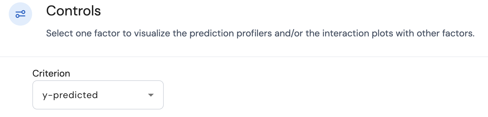
Here there are two choices:
- y-predicted: This concerns the predicted values for the average for each response.
- PoS: This concerns the calculated probability of success values for each response.
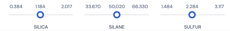
A profiler plot is available for each combination of the input factor and response variable. The settings for all input factors that appear in the selected models can be changed using the sliders that are available at the bottom of the screen. An example is provided below.
Selecting y-predicted
In a single profiler plot for a given combination of the input factor and response variable, the black line represents the relationship between the input factor and the predicted value for the average of the specific response variable. Here is an example of such a plot.
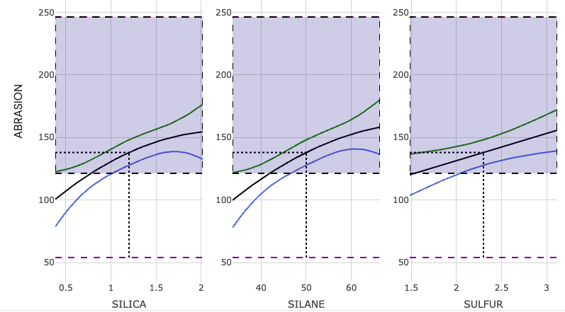
- If the black line is straight, this shows that based on the selected model for the said response variable, the effect of changing the setting of the input factor (while keeping the settings of the remaining input factors fixed) results in a linear or proportional change in the predicted value for the average of the specific response variable.
- If the black line is a curve (not straight), this shows that based on the selected model for the said response variable, the effect of changing the setting of the input factor (while keeping the settings of the remaining input factors fixed) results in a non-linear or non-proportional change in the predicted value for the average of the specific response variable. This indicates that a quadratic effect corresponding to this input factor is present in the selected model corresponding to the given response variable. In the example plot above, the plot shows that the factors Silica and Silane have their corresponding quadratic effects present in the selected model.
It is possible that changing the setting of a specific input factor results in a tilting effect on the black lines present in other profiler plots concerning different input factors but for the same response variable. For example, for a given response variable, if change in the levels for factor A, results in the tilting of the black line present in the profiler concerning factor B, then this is an indication that there is an interaction effect A x B present in the selected model. The greater the degree of tilting of the black line in the profiler for factor B, the greater is the effect of this interaction effect. It is possible that a single factor may have interactions with multiple other factors.
In each profiler plot,
- The green and blue lines represent the upper and lower bounds corresponding to the interval type selected in the Responses tab.
- The dashed black lines make it easier to get the exact values for the predicted mean for a given value of the input factor.
- The shaded purple area indicates the range of response values that have been prespecified in the Responses tab as desirable.
Selecting PoS
Here the black line now represents the relationship between the input factor and the PoS value concerning the specific response variable. Here is an example of such a plot.
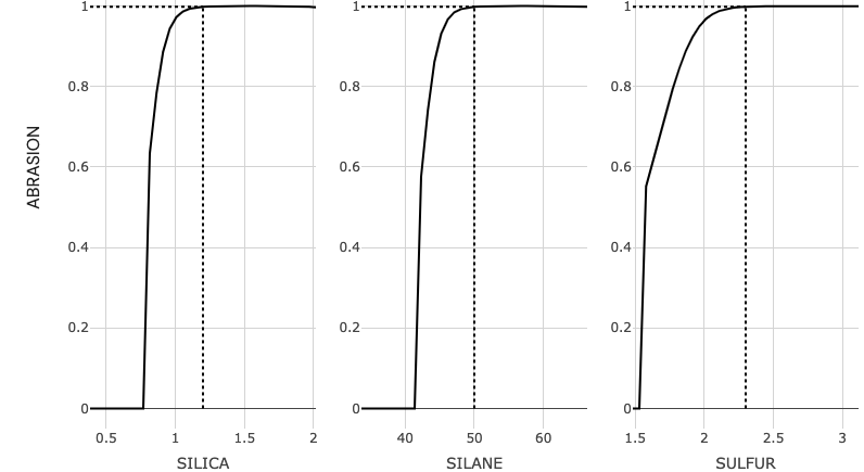
In each profiler plot, the dashed black lines make it easier to get the exact values for the PoS values for a given value of the input factor.
Page last modified on 28 February 2025