Modeling results
Modeling options and filters
In the Modeling results page, the results that are displayed are based on two specifications: The selected response variable and the transformation type selected.
At the top of this page, you will find two boxes that indicate this. An example is given below:
In the Response box, the name of the corresponding response variable is displayed and in the Transformation box, the specific transformation of the response variable used in the modeling is displayed.
If the modeling calculations for this dataset were completed for multiple response variables, then the dropdown menu for the Response box (refer image above) will allow the user to switch between modeling results for the different reponse variables.
If a response variable was modeled using more than one type of transformation, then the dropdown menu for the Transformation box (refer image above) will allow the user to switch between modeling results for the different transformations for the specific response variable specified in the Response box.
Other options for filtering
-
Forcing and removing effects
If the user has some prior knowledge that certain effects must be included in all models that they wish to consider, the user can specify this using the Force effects in the model dropdown option as shown below.
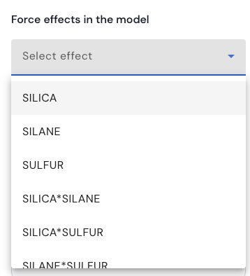
The dropdown list will display all effects that were originally considered for the analysis. This option allows the user to specify more than one effect to include in all models. Similarly, if the user has some prior knowledge that certain effects must be excluded in all models that they wish to consider, the user can specify this using the Force effects NOT in the model dropdown option.
-
Heredity
If the user wishes to review models that obey a certain type of heredity assumption, this can be specified using the checkboxes provided under the heading Heredity (as given below).
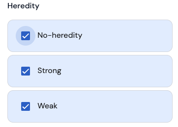
A description of the concept of heredity can be found here.
To include all models that satisfy the strong heredity assumption, tick the box with the label ‘Strong’, to include all models that satisfy the weak heredity assumption, tick the box with the label ‘Weak’, and finally, to include all models that do not satify neither strong nor weak heredity, tick the box with the label ‘No-heredity’.
Plots with modeling results
For the specified combination of response variable and type of transformation, three graphs/plots are provided:
-
Effects in the generated models rasterplot
Here is an example of such a plot.
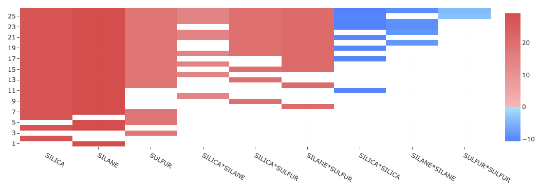
This is called a raster plot which can be viewed as a table with certain number of rows and columns. Each row in this table corresponds to one specific model. For a given row, the number of highlighted cells indicates the number of effects that are present in that model, while the different columns corresponding to the highlighted cells, indicate which specific effects are present in that model.
For example, in the image given above, there are 26 rows, which means that there are 26 models presented in the raster plot. The last row at the bottom indicates that the model corresponding to this particular row, has only one effect which is the main effect of ‘SILANE’ corresponding to column number two. By hovering with the mouse pointer, you can review other rows (models) and columns (effects) too.
All models in the raster plot are ranked by the size of the models, with models that have a larger number of terms appearing at the top and the ones with a smaller number of terms appearing at the bottom.
On hovering over a particular cell, the ‘x’ value indicates the effect or column that cell corresponds to, the ‘y’ value indicates the model or row that the cell corresponds to, and the ‘z’ value indicates a value which matches the intensity of the color highlighted in the cell. The color code of the cells is determined by the following option
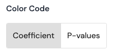
If the Effects option is selected, for a given row (model), a red colored cell indicates that the corresponding effect has a positive value for its coefficient in that model, while a blue colored cell indicates a negative value. The darker the color, the more signficant is the value (positive or negative) for the coefficient.
If the P-values option is selected, for a given row (model), the colors of the cells are divided (according to the legend in the image to the right) by the following ranges for the p-values:
• Between 1 and 0.75
• Between 0.75 and 0.50
• Between 0.50 and 0.20
• Between 0.20 and 0.10
• Between 0.10 and 0.05
• Between 0.05 and 0.01
• Less than 0.01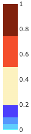
Note that for any mixed model analysis involving one or more random effects (i.e variance components), all p-values that are reported are based on the corrected degrees of freedom calculated according to the method of Kenward and Roger (1997)1.
All models that are displayed in the raster plot are charcterized based on metrics that quanitify the statistical quality of each of the models. To see this, click on

This will open up a parallel coordinate plot which allows you to visualize all models that appear in the raster plot based on the total number of effects, root mean squared error (RMSE), R2 adjusted, corrected AIC (Hurvich and Tsai 19892) and PRESS. For mixed model analysis, the conditional R2 adjusted is reported which also takes into account the variance in the response explained by the random effects (i.e variance components).
An example of such a plot is given below
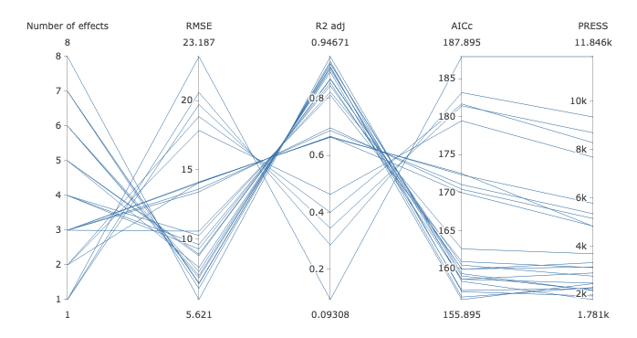
This plot is interactive and therefore allows the user to specify vertical constraints on each of the five provided criteria. For example, to display all models with 5 and 6 terms, define a constraint as follows:
Hover close to the vertical axis corresponding to the number of effects. The mouse pointer will change to a plus sign. When this happens, click on the vertical line in a region just below the value 5 and drag the mouse pointer to an area just above 6 and leave. A pink line will appear confirming you specification. Additional constraints can be specified on other vertical axes corresponding to other model ranking criteria. To remove a constraint, hover over the pink line which you would like to remove and when the cursor turns to a sign that points in the up and down direction, click once and the pink line will be removed. Note that only one constraint can be specified per axis.
After all constraints are specified, click the OK button, upon which the user will observe that only the models that satisfy the specified constraints on the model ranking criteria will remain in the raster plot. The plots discussed below will also be updated due to this filtering.
To practice using such a plot, refer here.
-
Box plots
Here is an example of such a plot.
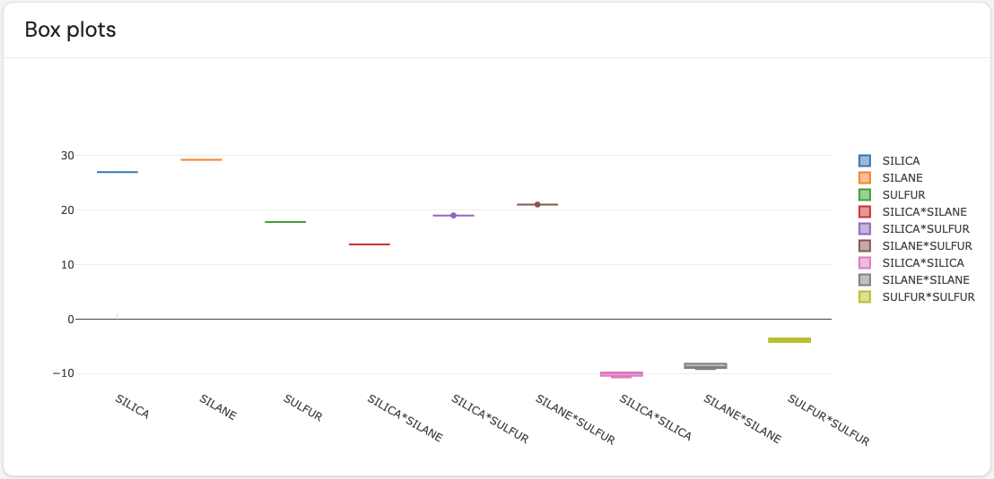
The different effects are marked on the x-axis, where for each effect a boxplot is presented. For a given effect, its corresponding boxplot shows the distribution of values based on the option set for the option color code. If the color code is set to ‘Coefficient’, then the boxplot for a given effect shows the distribution of coefficient values across all models displayed in the raster plot which include that effect. The example plot above displays the coefficient sizes for each of the effects in the example dataset. Similarly, if the color code is set to ‘P-values’, then the boxplot gives the distribution of p-values across all models displayed in the raster plot which include that effect
For a given effect, if there is a wider distribution of values in the boxplot, this suggests that the values for the coefficient/p-values is highly variable across all models that are displayed in the raster plot.
-
Effect frequencies
Here is an example of such a plot.
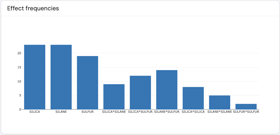
The different effects are marked on the x-axis, where for each effect a barplot is presented. For a given effect, its corresponding barplot gives the total number of times it appears across all models that are displayed in the raster plot. For a given effect, the bigger the barplot, the greater number of times this effect appears across all models presented in the raster plot. This plot helps identify which effects consistently appear across all models.
Additional options
Show Intercept
This option is presented as follows

where this option can be toggled on or off. When on, the rasterplot, boxplot and the effect frequency plot, will display additional columns to indicate which effects did not appear in all models that presented in the raster plot.
Choosing a final model
There are two ways to select a final model: recommended and manual.
If the user prefers the software to recommend a single best model, click on the following button

When this button is clicked, the software will recommend the best model of all models that appear in the raster plot using the utopia method considering the following criteria: corrected AIC (Hurvich and Tsai 1989) and PRESS. More information on the utopia method can be found here.
To select a final model manually, use the graphical filtering and the other options discussed above to filter out the single model of interest, and then click on the Get recommended model button.
On clicking the Get recommended model button, all model diagnostic results will appear for the selected model.
References:
Page last modified on 15 May 2025