Interactive graphical comparison
Select a subset of designs and the most important statistical quality indicators for you to access the interactive graphical comparison capabilities of our software.
The interactive graphical comparison is located in the middle section of the page. When the user selects the quality indicators that are most important for their problem, the software will provide a graphical analysis of the designs selected in the table at the top of the page.
The figure below is a screenshot of the graphical comparison tool. On the left side there is a menu with different tabs that contain the quality indicators. On the right side, a graphical analysis of the designs regarding the selected quality indicators is displayed.
Depending on how many indicators are selected, a different graph is displayed:
- If the user selects 2 indicators, then a scatter plot is generated.
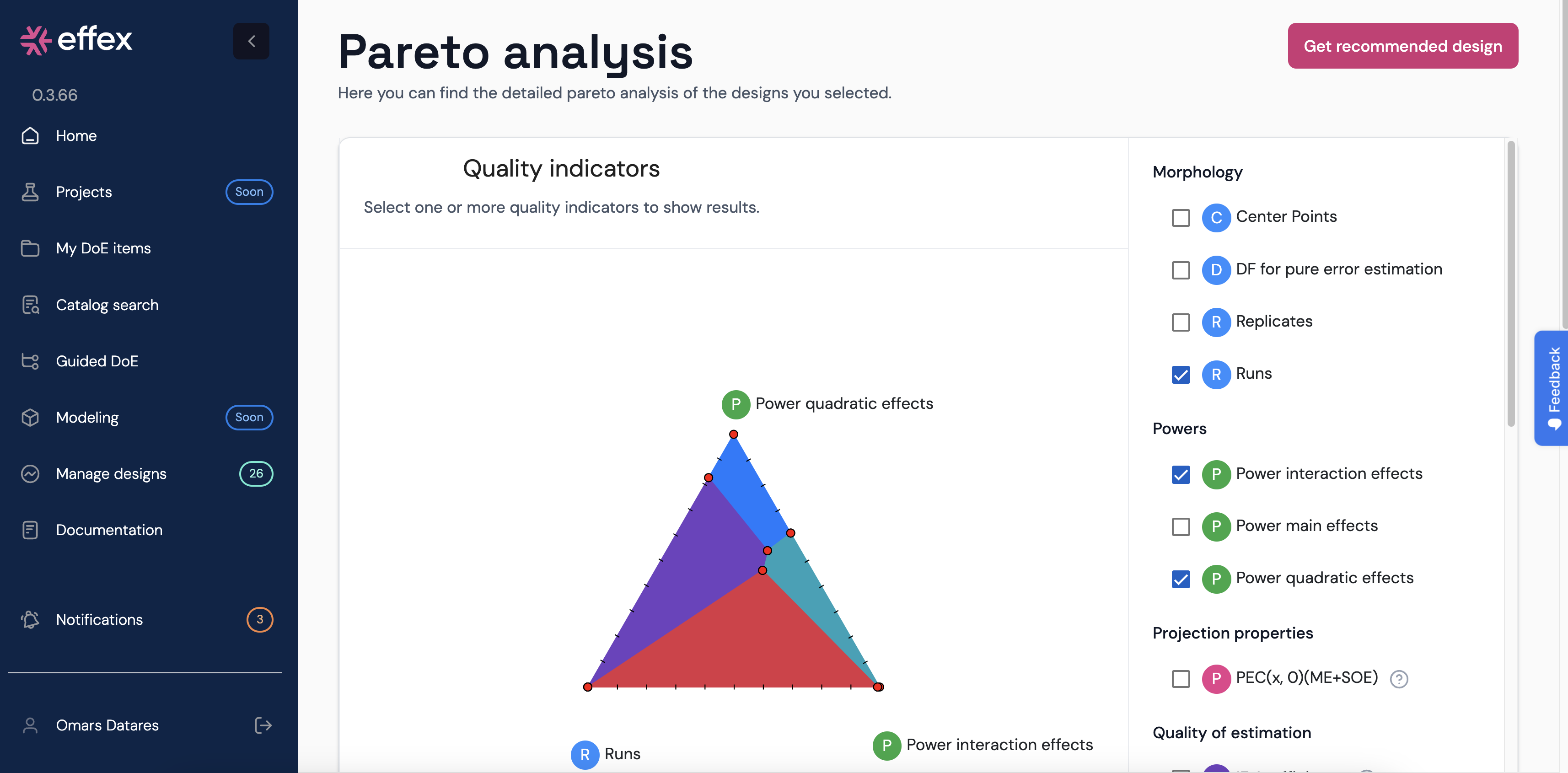
- If the user selects 3 indicators, then a ternary plot is displayed.
- When the number of selected indicators is more than 3, then the software displays a parallel coordinate plot.
The list of indicators that can be selected are:
- Morphology
- Center points
- Degrees of freedom for pure error estimation
- Replicates
- Number of runs
- Powers
- Power to detect a main effect
- Power to detect an interaction effect
- Power to detect a quadratic effect
- Projection properties
- PEC(x,0)(ME+SOE)
- PEC(0,x)(ME+SOE)
- Quality of estimation
- D- and A-efficiencies for a main effects model: D(ME), A(ME)
- D- and A-efficiencies for a main and interaction effects model: D(IE), A(IE)
- D- and A-efficiencies for a main and second-order effects model: D(SOE), A(SOE)
- Maximum 4th order correlation
- Quality of prediction
- G-efficiency and prediction variances for a main effects model
- G-efficiency and prediction variances for a main and interaction effects model
- G-efficiency and prediction variances for a main and second-order effects model
The scatter plot
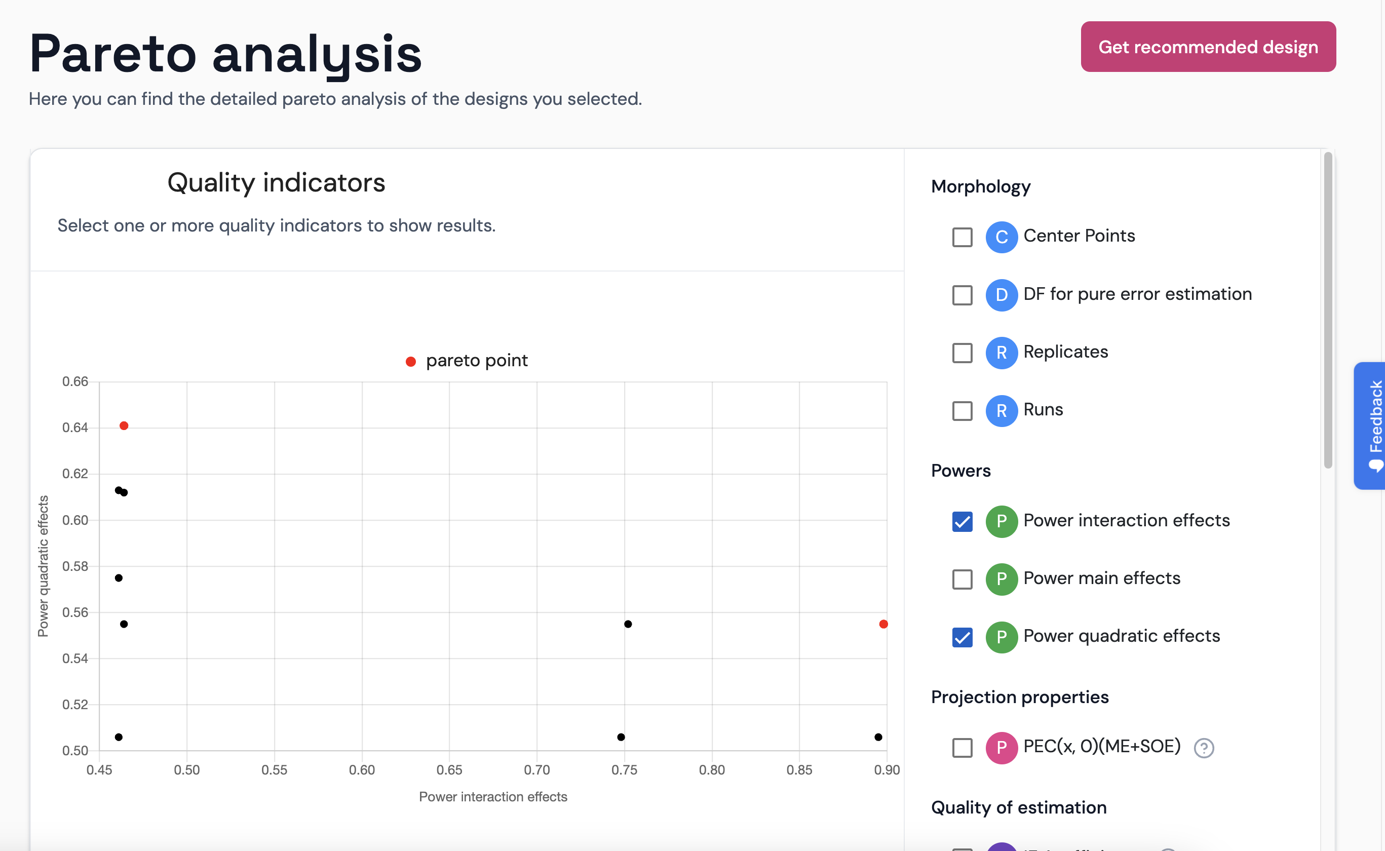
As all indicators are numerical, it is straightforward to plot them in a 2D scatter plot. The software does plot some points in red color: those that are pareto efficient points. When the mouse pointer stands over one of the points in the graph, the software will inform about which design it is.
The ternary plot
A ternary plot is a natural way to perform a multi-criteria comparison of a set of designs characterized by three numerical attributes. To this end,
- on each vertex of the triangle one of the selected indicators is placed, and
- the selected designs correspond to the colored areas in the ternary plot.
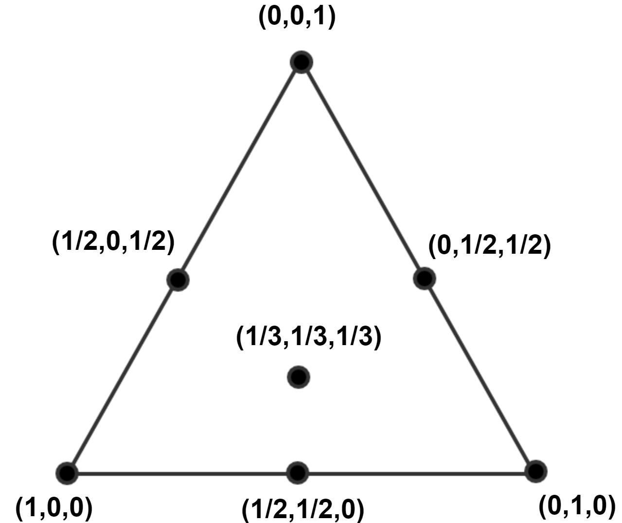
A point in the triangle corresponds to a set of weights for the three indicators. In the figure above, the left corner point corresponds to a weight vector $(1,0,0)$, the upper vertex to $(0,1,0)$, and the right vertex to $(0,0,1)$. The figure below displays some points in the triangle and their corresponding weight coordinates. A point in the center of gravity of the triangle has weight coordinates of $(1/3,1/3,1/3)$.
The color areas indicate which design(s) perform the best for the corresponding set of weights (each weight is applied to one indicator).
The parallel coordinates plot
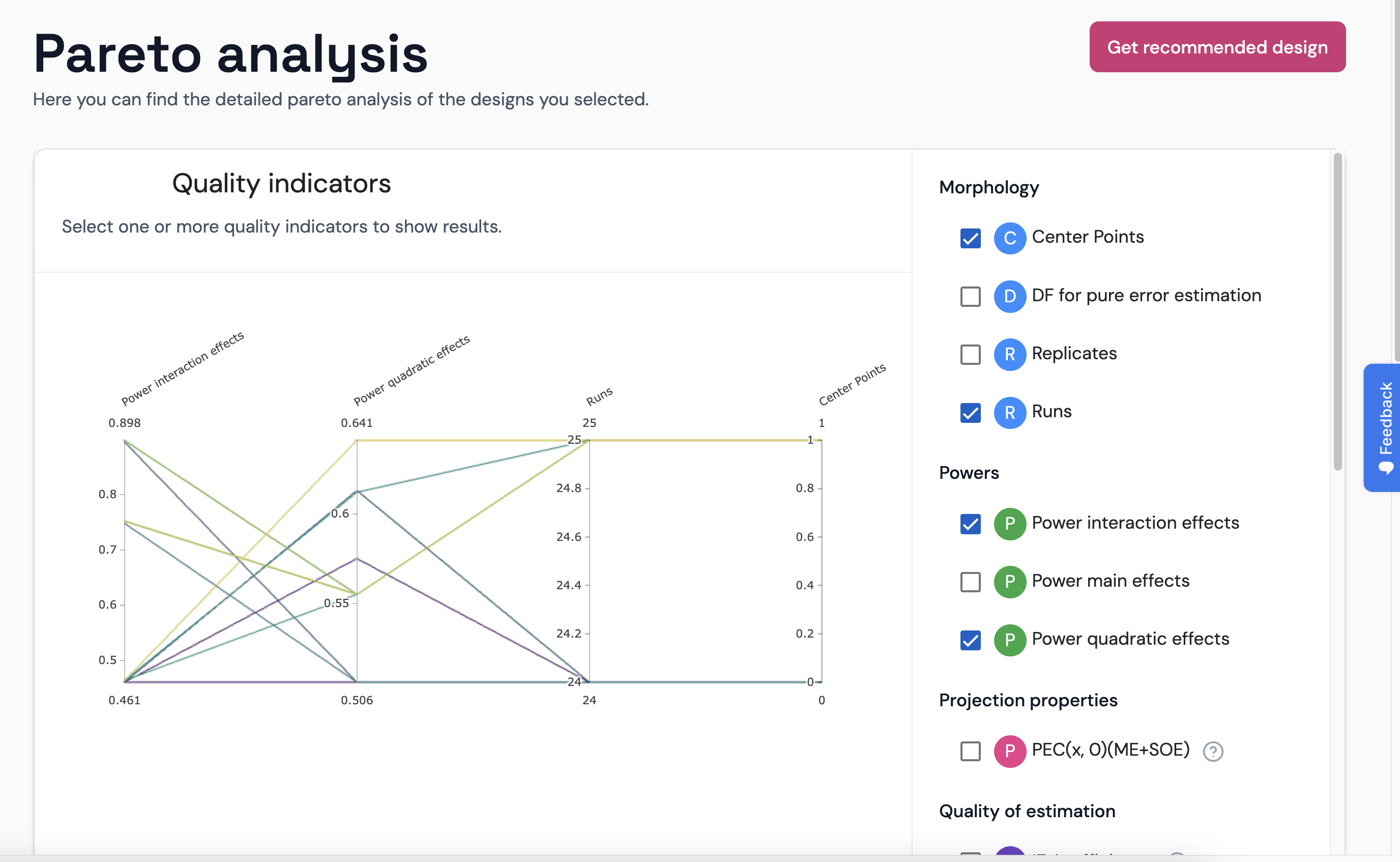
The parallel coordinate plot is a very useful graph to display many items characterized by many attributes. You can enlarge the graph by clicking in the button, which will open a pop-up window.