Model details (for mixed models)
On clicking the Get recommended model button, all model diagnostic results will appear for the selected model. This screen has six tabs:
- Summary
- Effect details
- Q-Q plot
- Diagnostic graphs
- Actual vs Predicted
- Variance components
1. Summary
In this summary tab, the model is described using many quantitive and qualitative measures, out of which some measures describe the statistical quality of the selected model. These are:
-
Root mean squared error (RMSE): The RMSE is an estimate for the standard deviation. More generally, it is an estimate that quantifies the prediction accuracy of the selected model. The lower the value for RMSE, the better is the prediction accuracy. This is calculated as follows: $$RMSE = \sqrt{\frac{\sum_{i=1}^{N}{(y_i - \widehat{y}_i)}^2}{N-p}}$$ where
$N$ – total number of observations
$i=1,\dots,N$
$y_i$ – observed value for the observation number $i$
$\widehat{y}_i$ – predicted value for the observation number $i$ conditioned on the random effect (i.e predicted value based on the conditional model)
$p$ – number of effects in the selected model including the intercept. -
Conditional $R^2$ and Marginal $R^2$: The conditional $R^2$ is the value for the coefficient of determination including the variance in the response explained by the variance components, while the marginal $R^2$ excludes the variance associated with the variance components (see Piepho 20231 for more details).
-
Akaike information criterion (AIC) and corrected AIC (See here)
-
Bayesian information criterion (BIC).
-
Predicted residual error sum of squares (PRESS).
-
Condition number: Ratio between the maximum and minimum eigen value of the information matrix of the model matrix.
2. Effect details
In this tab, the details for the statistical tests performed on each effect is displayed in a table. For each effect in the selected model, the following information is provided:
-
The effect’s coefficient value (2nd column). This quantifies the size of the effect’s contribution in changing the average value of the response.
-
The standard error for the effect’s coefficient (3rd column). Since the true coefficient values are unknown and are estimated from the data, there is some uncertainty around the estimated coefficient value. The standard error quantifies the uncertainty associated with the estimated coefficient value.
-
The 4th and 5th columns '[0.025' and ‘0.975]' give the lower and upper bounds for the coefficient values calculated at 0.025 and 0.975 percentiles with a confidence of 95%.
-
Degrees of Freedom (6th column): For linear mixed models, the denominator degrees of freedom used in the t-tests is calculated based on the method of Kenward and Roger (1997)2 which takes into account the random components and provides a more accurate test for statistical significance for all the effects.
-
T-statistic (7th column) is a measure that is calculated to assess the statisfical significance of an effect. For a given effect, if the T-statistic value if much larger than 0, it is likely that the effect is statistically significant.
-
P-value (8th column) is a measure that is based on the T-statistic, which quantifies the probability to observe the estimated coefficient value just by chance or when the true coefficient value is zero. The lower the p-value, the more likely that that the effect is statistically signicant. For a given effect, if the p-value is lower than 0.05, we say that the effect is statistically significant.
3. Q-Q plot
A Q-Q plot is used to check if the residuals for all observations are normally distributed. Here is an example of such a chart.
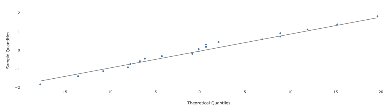
The x-axis represents the magnitude for the residuals, and the y-axis represents the z-score corresponding to each individual residual after sorting all residuals. If all points on the plot lie close to the straight black line, then this is an indication that the normality assumption for the residuals is satisfied.
4. Diagnostic graphs
In this tab several model diagnostic plots are presented.
Marginal residuals vs Actual response
In this plot, for the marginal model which excludes the variance explained by the random effects, the actual response values (x-axis) are plotted against the residuals. Here is an example of such a plot:
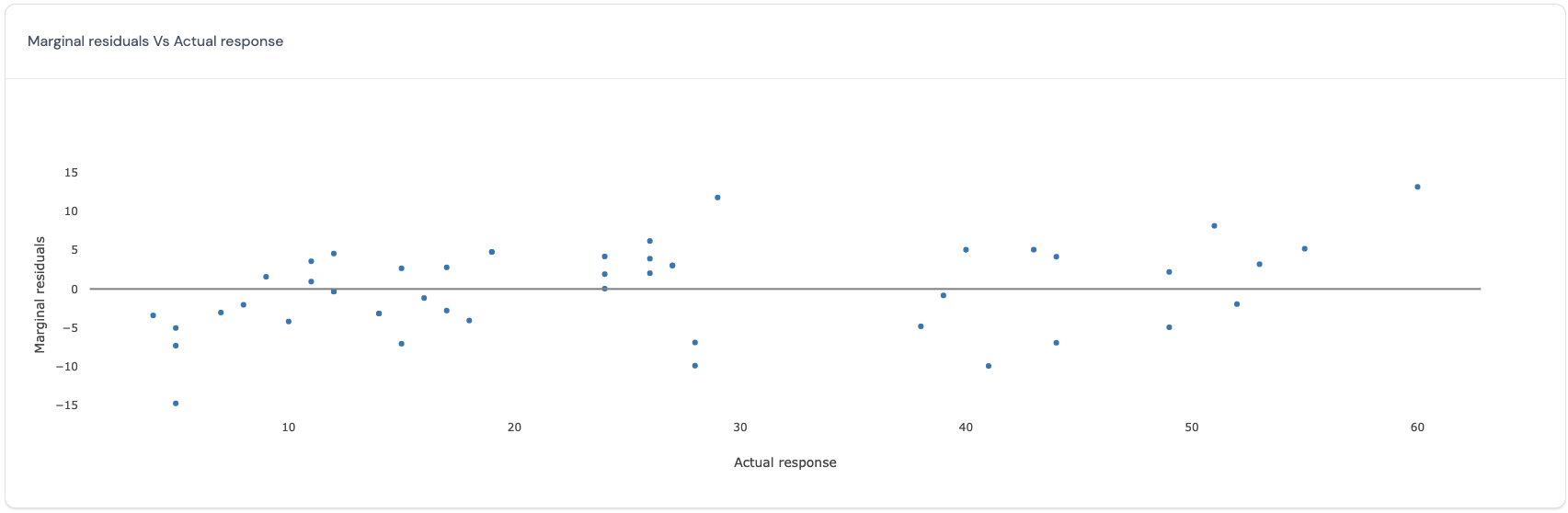
If all points in this plot are randomly scattered around the central line without any visible trend, this indicates that the residuals obtained from the selected marginal model satisfy the assumption of homoscedasticity and independence for all residuals across all the actual observed values for the response. However, if there is a trend, then this may be a cause for concern as this indicates that the residuals vary in a systematic manner with respect to the actual value and that the assumptions of independence and homoscedasticity may be violated.
Conditional standardized residuals vs Predicted response
In this plot, for the conditional model which includes the variance explained by the random effects, the predicted values (x-axis) are plotted against the standardized residuals (y-axis). Here is an example of such a plot:
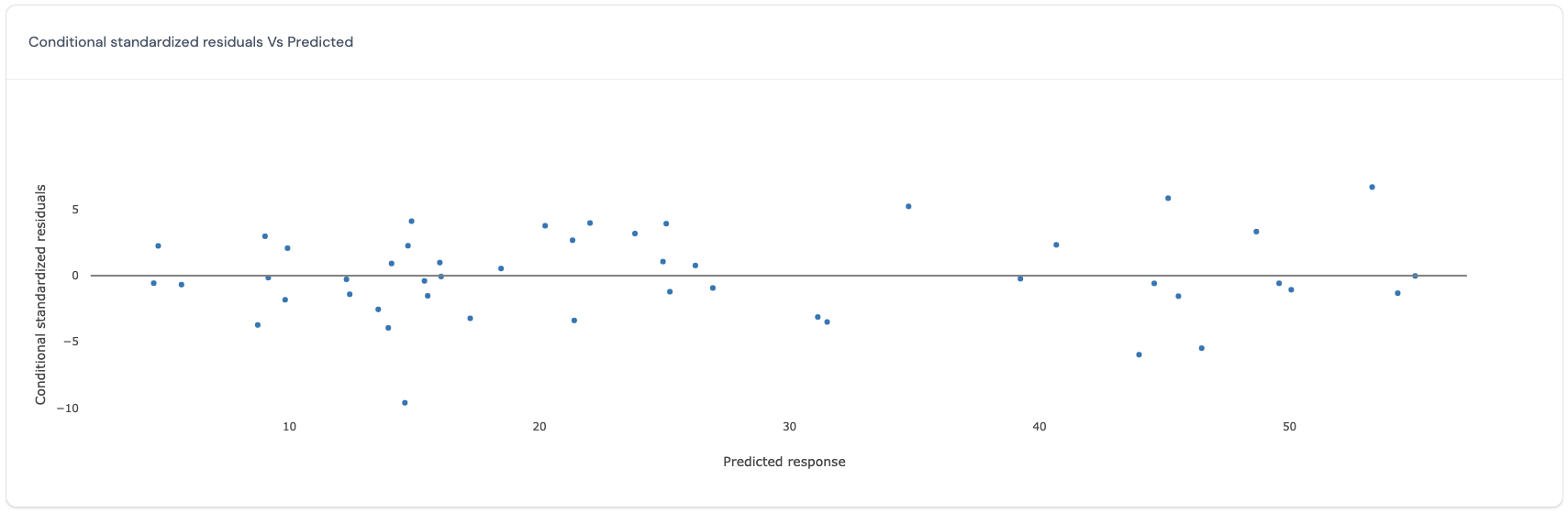
If all points in this plot are randomly scattered around the central line without any visible trend, this indicates that the standardized residuals obtained from the selected conditional model satisfy the assumption of homoscedasticity and independence for all standardized residuals across all the predicted values for the response. However, if there is a trend, then this may be a cause for concern as this indicates that the standardized residuals vary in a systematic manner with respect to the predicted value and that the assumptions of independence and homoscedasticity may be violated.
Conditional standardized residuals vs Row number
In this plot, for the conditional model which includes the variance explained by the random effects, the predicted values (x-axis) are plotted against the row number of each data point (y-axis). Here is an example of such a plot:
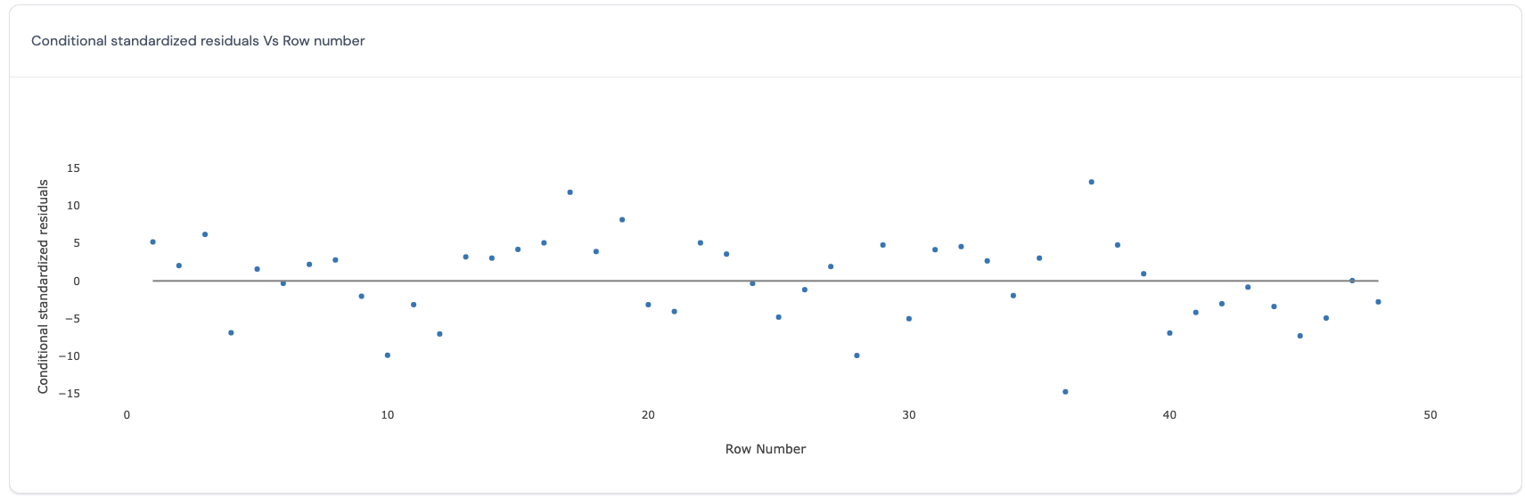
If all points in this plot are randomly scattered around the central line without any visible trend, this indicates that the residuals obtained from the selected model satisfy the assumption of homoscedasticity and independence for all residuals across the run order. However, if there is a trend, then this may be a cause for concern as this indicates that the run order is important to consider in the model and that the assumptions of independence and homoscedasticity may be violated.
Cook’s distance vs Row number
In this plot, the Cook’s distances (y-axis) are plotted against the row number of each data point (x-axis). The Cook’s distance (Cook, 19773) reflects how influential a data point is in determining the estimates for all the fixed effects. Here is an example of such a plot:
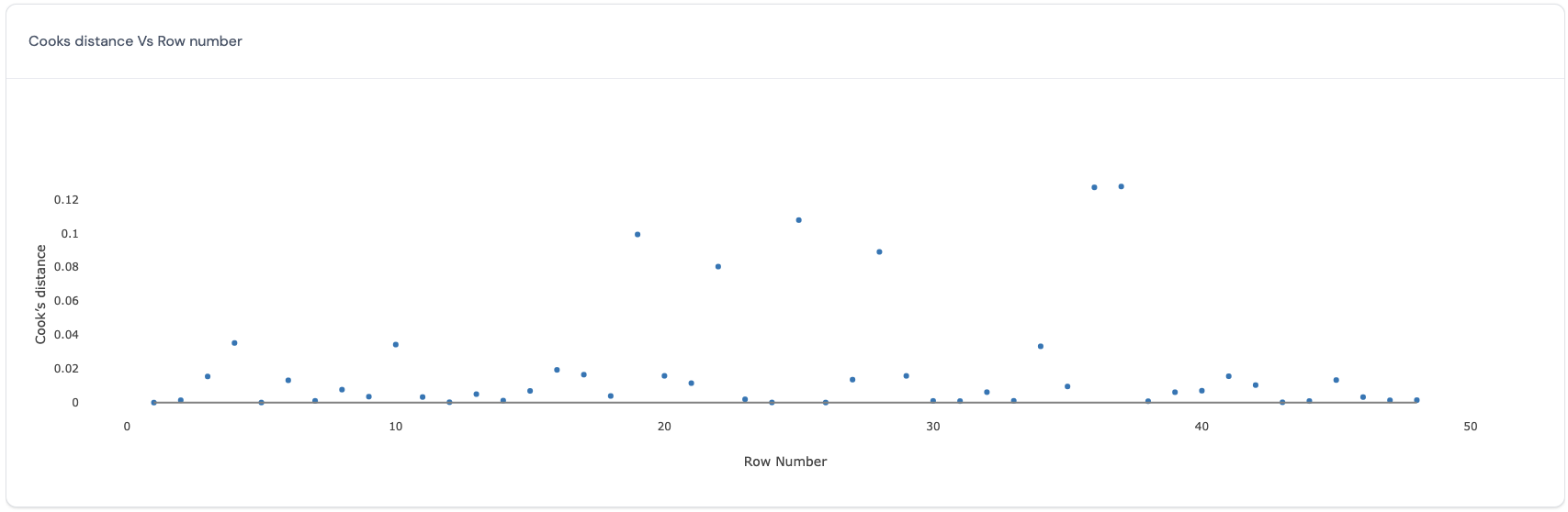
Ideally, all data points have similar values for the Cook’s distance. Data points with larger values for the cook’s distance are more influential in determining the estimates for all the fixed effects. Therefore, deleting the data points with large values for the Cook’s distance will produce big differences in the estimates for all the fixed effects.
MDFFITS vs Row number
In this plot, the MDFFITS values (y-axis) are plotted against the row number of each data point (x-axis). Similar to the Cook’s distance, MDFFITS or multivariate DFFITS (Belsley, D.A., Kuh, E., and Welsch, R.E., 19804) value also reflects how influential a data point is in determining the estimates for the marginal model. The difference between the two criteria is that the latter uses the variance covariance matrix for the fixed effects after deleting the specific data point, while the former uses the same variance covariance matrix for all Cook’s distance calculations. Therefore, this chart will be very similar to the one discussed above. Here is an example of such a plot:
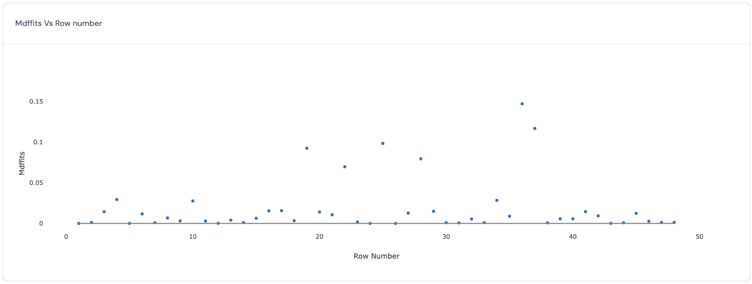
Ideally, all data points have similar values for the MDFFITS. Data points with larger values for the MDFFITS are more influential in determining the estimates for all the fixed effects. Therefore, deleting the data points with large values for the MDFFITS will produce big differences in the estimates for all the fixed effects.
5. Actual vs Predicted In this tab, a scatter plot is displayed where for each observation, the actual value of the response variable (on the y-axis) are plotted against its predicted value (on the x-axis). Such a plot is a diagnostic tool to make sure that all predicted values are similar to the actual values in the dataset. Here is an example of such a plot.
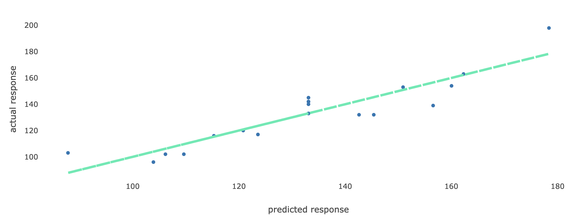
If all points on the plot lie close to the straight line, then this is an indication that all predicted values obtained using the selected model are close to the true observed values in the dataset, and hence the model performs well in terms of predicting values for the response variable.
6. Variance components
(This section will soon be updated.)
If the selected model passes all visual diagnostic checks, click on

to continue to use this selected model to proceed to the optimization step to find the optimal settings of the input factors.
Note: If the selected model does not pass all visual diagnostic checks, click on the following button

to return to the Modeling results page to choose another model.
References:
-
Piepho, Hans‐Peter (2023). “An adjusted coefficient of determination (R2) for generalized linear mixed models in one go.” Biometrical Journal 65.7. ↩︎
-
Kenward, M. G., & Roger, J. H. (1997). Small sample inference for fixed effects from restricted maximum likelihood. Biometrics, 983-997. ↩︎
-
Cook, R.D. (1977), “Detection of Influential Observations in Linear Regression,” Technometrics, 19, 15–18. ↩︎
-
Belsley, D.A., Kuh, E., and Welsch, R.E. (1980), Regression Diagnostics; Identifying Influential Data and Sources of Collinearity, New York: John Wiley & Sons ↩︎
Page last modified on 19 March 2025